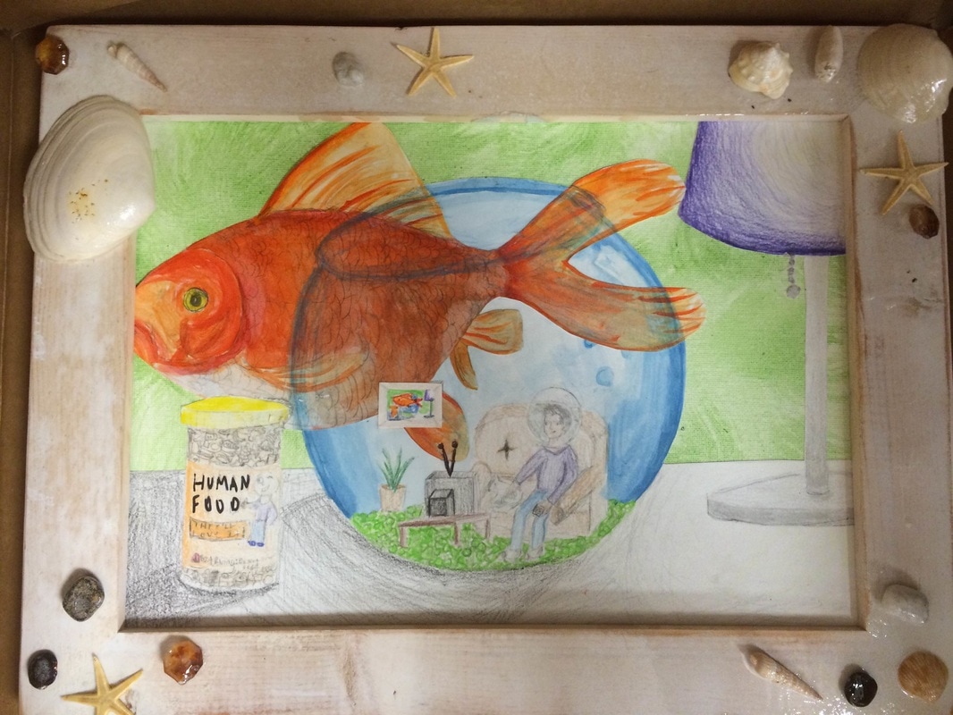
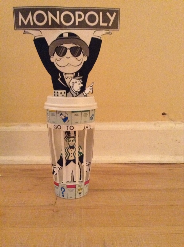
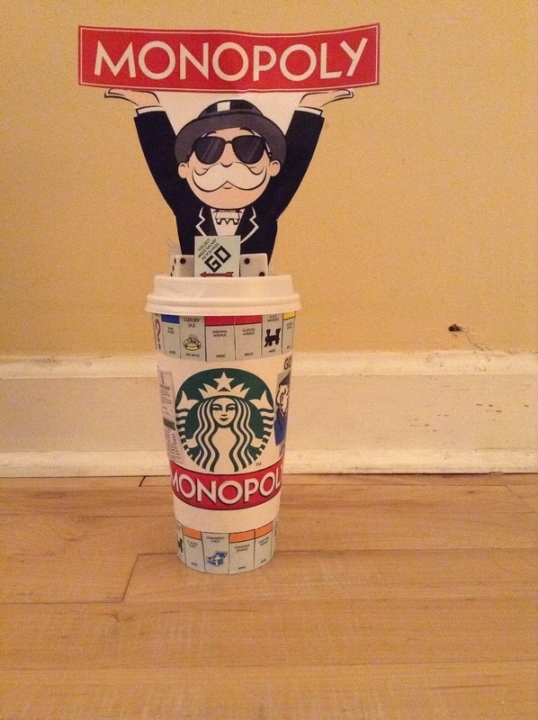
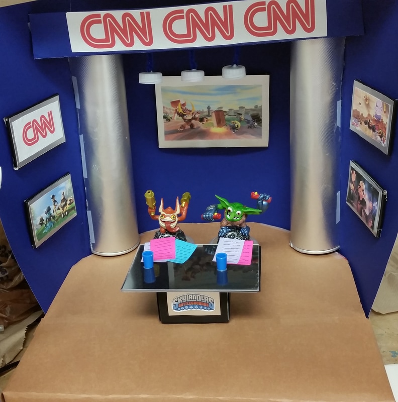
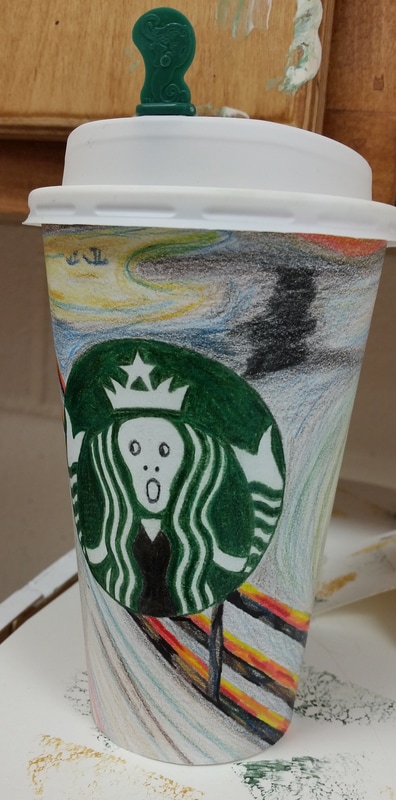
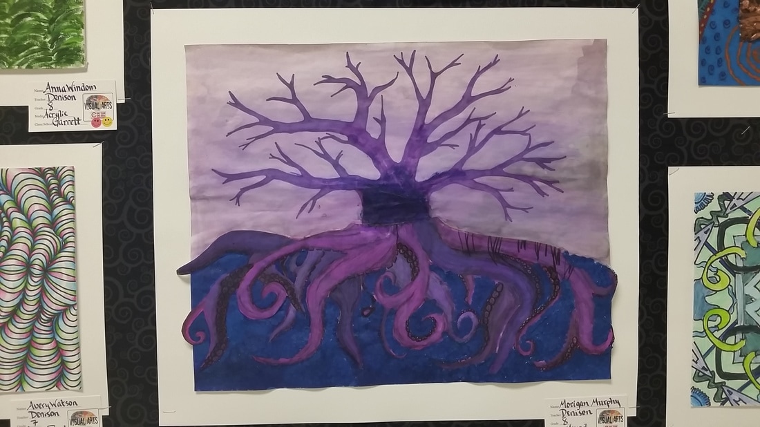
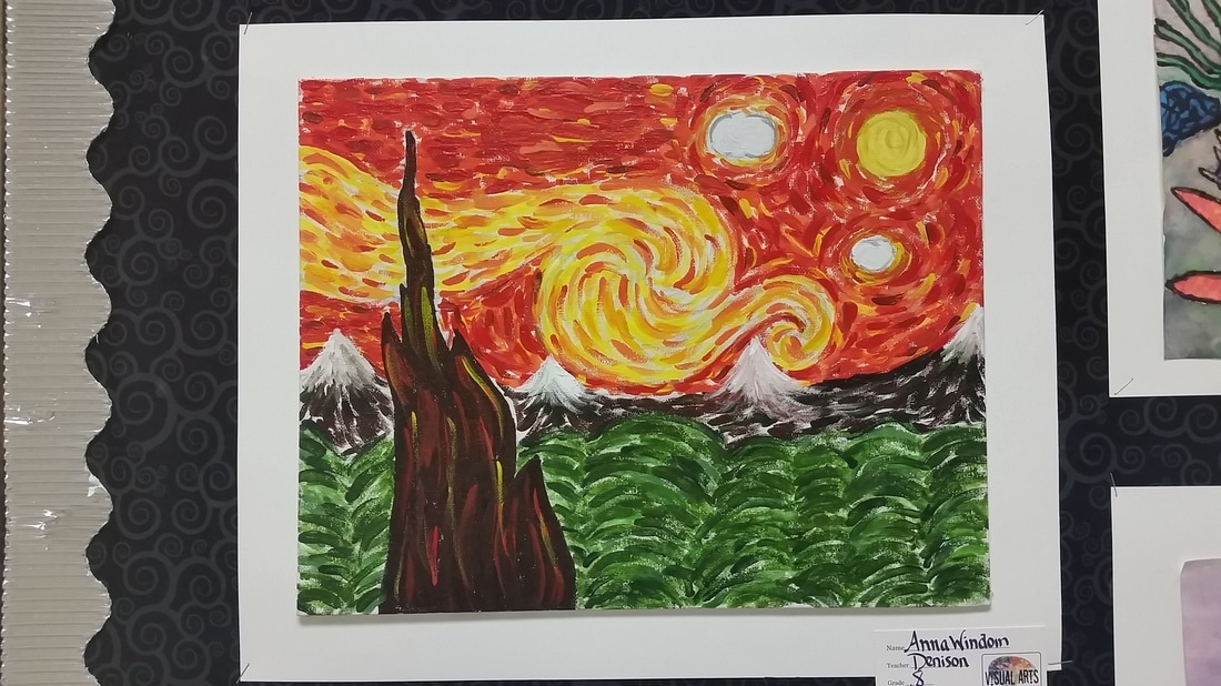
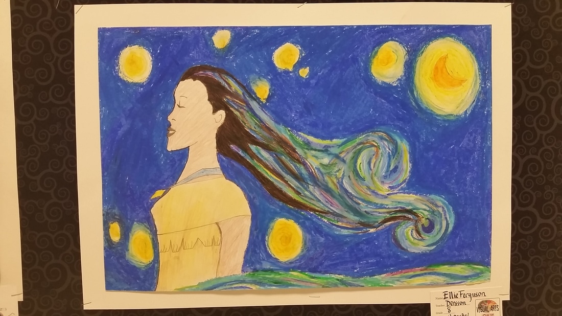
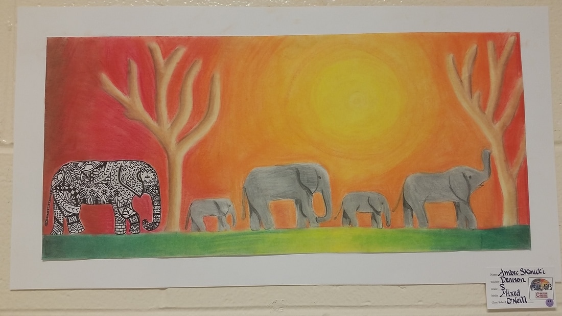
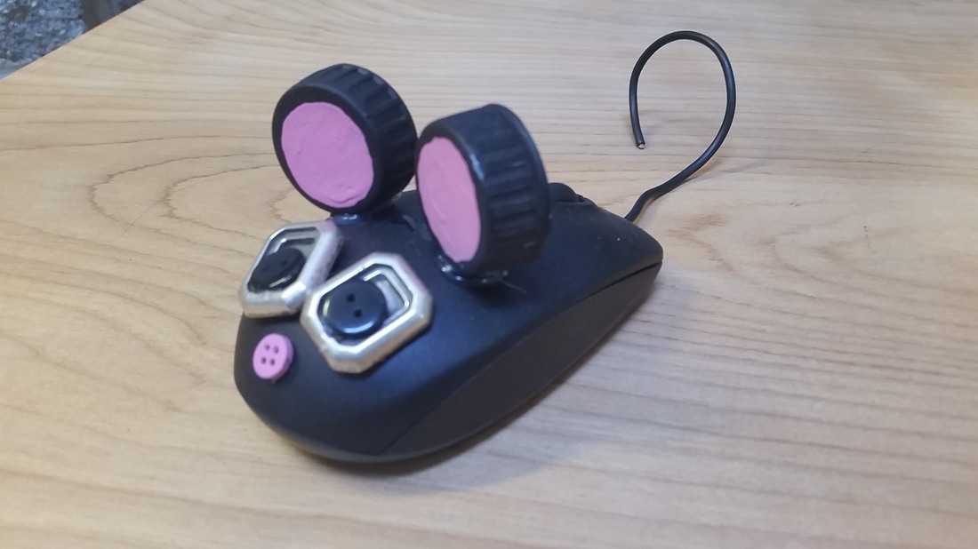
Please check out this wonderful artist statement from Sarah H. that was submitted last year. Notice she has a wonderful title with a descriptive explanation, an explanation of the elements and principles of design she used within her piece. The one thing she could have done better, was include a much more detailed description of what she was mashing up. (one sentence isn't enough to cover this!)
 |  |
Trapped in the Frapp
By Sarah Hilliard
For this piece of artwork I decided to mash-up the well-known Starbucks logo/cup and a very popular game board known as Monopoly. To start out I cut a rectangle into the cup to create a “jail cell” for the Starbucks/monopoly guy mash-up. I then tried to “recreate” the monopoly game board on the cup, and around the jail cell. I did this by using pictures of the board, and gluing them around the top and bottom of the cup. On top of the lid I printed out a colored and black and white picture of the monopoly guy holding up a “Monopoly” sign. I cut them out and glued them back to back and then glued it onto the lid, where the black and white side was facing the jail cell to give it more of an old look, and I faced the colored side towards the Starbucks and monopoly logo on the other side of the cup to give it a more colorful and fun look. I also glued some dice onto both sides of the lid to represent the monopoly game. For the Starbucks/Monopoly man inside the jail cell I used a picture and a cut out of the Starbucks logo to create a mash-up between them also. I glued the Monopoly logo underneath the Starbucks logo, so that they look like they are apart of one thing. The “Go to jail” man in the Monopoly game shows up a lot of the cup because the jail cell is one of the main things that catches your attention, other than the monopoly guy on top of the lid. The tite I chose for this piece of art was “Trapped in the Frapp.” I chose it because the “Frappuccino” is something that Starbucks is well known for, and I made a Monopoly/Starbucks man “trapped” inside the Starbucks cup, which is where I got the idea for, “Trapped in the Frapp” because the man is “trapped” in the frapp/jail cell.
There were two main principals that I used in my mash-up. I think that those two principals are unity, and emphasis. Unity is achieved in this mash-up because all of the components of the board game that are on the cup, work together to give the art work a sense of completion. I glue pictures of the spaces on both the top and bottom of the cup which makes it look more unified, and harmonious. There is also unity in the Starbucks/Monopoly man in the jail cell, because I used two different things, and put them together to make one unified person. The second principal that I think occurred a lot in this mash-up was emphasis. The giant Monopoly man holding up a sign is most likely going to be the first thing that you see when you look at this mash-up. It is the main focal point, where your eye lands first; it grabs your attention, which creates emphasis. However, the more you look around the cup there are many other main focal points, like the jail cell, it creates a center of interest, as well as the Starbucks and Monopoly logo on the other side of the cup.
Other than the principals included in this mash-up, there were many different elements of art that were included also. I think that the two main elements that were in this mash-up were form and color. Form is achieved in this mash-up because I used a Starbucks cup for one part of my mash-up, which is a three-dimensional object with a height, width, and length, and it can be viewed from many different sides. I also used form by including dice into my mash-up, which are on top of both sides of the lid. I achieved the element of color into my mash-up by using various shades of colors, like green for example. There is a dark shade of green on the Starbucks logo, and there is a lighter hue/shade of green on the board pieces that I placed at the bottom and top of the cup. There are a variety of colors that come from the three primary colors and black and white on the cup.


 RSS Feed
